<!– CSS KODU –>
<style>
body {
background: #ccc;
width: 800px;
}
.box h3 {
text-align: center;
position: relative;
top: 80px;
}
.box {
width: 70%;
height: 200px;
background: #FFF;
margin: 40px auto;
}
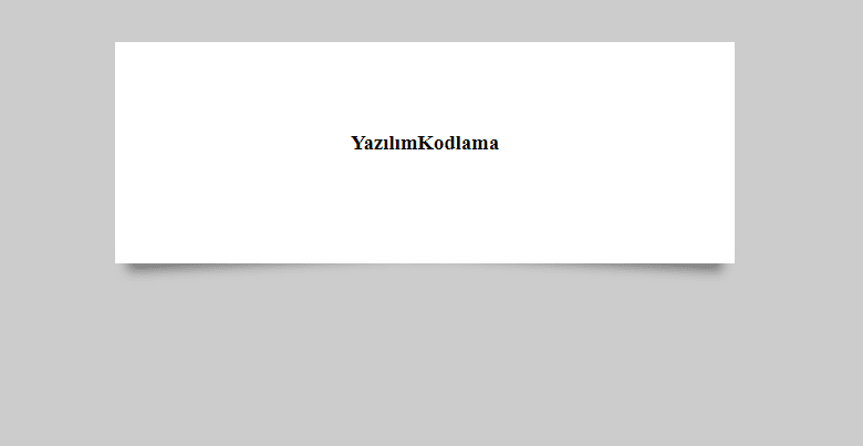
/*gölge efekti*/
.effect2 {
position: relative;
}
.effect2:before,
.effect2:after {
z-index: -1;
position: absolute;
content: “”;
bottom: 15px;
left: 10px;
width: 50%;
top: 80%;
max-width: 300px;
background: #777;
-webkit-box-shadow: 0 15px 10px #777;
-moz-box-shadow: 0 15px 10px #777;
box-shadow: 0 15px 10px #777;
-webkit-transform: rotate(-3deg);
-moz-transform: rotate(-3deg);
-o-transform: rotate(-3deg);
-ms-transform: rotate(-3deg);
transform: rotate(-3deg);
}
.effect2:after {
-webkit-transform: rotate(3deg);
-moz-transform: rotate(3deg);
-o-transform: rotate(3deg);
-ms-transform: rotate(3deg);
transform: rotate(3deg);
right: 10px;
left: auto;
}
</style>
<!– HTML KODU –>
<div class=“box effect2”>
<h3>YazılımKodlama</h3>
</div>